MACD Indicator: Moving Average Convergence Divergence
Open any crypto chart and you will probably see it sitting under the price: two wavy lines and a set of bars flicking above and below a zero line. That is the MACD indicator, the most-watched momentum tool in technical analysis. It is also the most misread. Plenty of crypto traders buy every time the lines cross, sell on the next cross, and slowly bleed out wondering why a "proven" signal keeps failing them.
The tool is not the problem. The way people use it is. This guide covers what the MACD measures, how to read its three parts, how to trade it on crypto specifically, and where it lets you down.
What the MACD indicator actually measures
Start with the name, because it is unusually honest. Moving Average Convergence Divergence. The tool tracks one thing: the gap between two moving averages of price. Widen that gap and momentum is building. Shrink it and momentum is bleeding away. That is the whole concept.
So treat the MACD as a momentum-based technical indicator, not a price target. It will not tell you where a coin is headed. What it tells you is whether the current move has real strength behind it, and whether that strength is growing or running out. Gerald Appel built the thing in the late 1970s for the stock market, decades before crypto, and the core idea has survived untouched.
Why bother with momentum at all? Because price lies. A coin can grind to a fresh high while the buying behind it quietly thins out. The MACD exists to catch that disagreement early. Picture a Bitcoin chart: BTC pokes out a new high, but the MACD prints a lower high. Price looks healthy. Momentum says the buyers are tired. That gap, between what price shows and what momentum shows, is the whole reason the tool stays on screen.
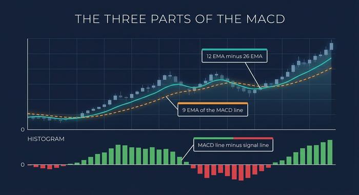
The MACD line, signal line and histogram
The indicator looks busy, but it is only three parts, and each one is built from the one before it.
The MACD line
This is the engine. The MACD line equals the 12-period exponential moving average (EMA) minus the 26-period EMA, as defined by StockCharts. Why an EMA and not a simple moving average? Because an EMA weights recent prices more heavily, while a simple moving average treats every period equally. So the 12-period reacts faster than the 26-period. Subtract the slow one from the fast one and you are left with a single line: it rises when short-term momentum pulls ahead, falls when it drops behind.
The signal line
Next comes the trigger. The signal line is a 9-period EMA of the MACD line itself, so it is a smoothed, slightly delayed echo of the engine. When the faster MACD line pulls away from this slower line, something is shifting. Most of the classic buy and sell signals are born right here, in how the two lines cross and separate.
The MACD histogram
The histogram is the bars, and it is the cleverest part. Each bar is just the MACD line minus the signal line, drawn above or below zero. Lines spread apart, bars grow. Lines close in, bars shrink toward zero. Thomas Aspray bolted this on in 1986, and it is still the best early-warning piece of the whole tool, because the bars start contracting before the lines actually cross. That contraction is your heads-up that momentum is stalling.
Reading the bars is its own skill. Tall, growing bars mean the move has real force behind it. Bars that shrink for several candles in a row, even while price keeps ticking up, mean the move is running out of steam. That contraction often shows up a candle or two before the lines cross, which is why histogram-watchers tend to act earlier than traders who wait for the crossover itself.
How to read MACD crossovers and signals
Three signals worth knowing, and they are not created equal. The loudest one is the weakest.
| Signal | How often it fires | Reliability |
|---|---|---|
| Signal line crossover | Often | Low (many false signals) |
| Zero line crossover | Less often | Medium (confirms a trend shift) |
| Divergence | Rare | High (but a warning, not a timer) |
Notice the pattern there. The signals that fire most often are the ones you can trust least. Weight them accordingly.
Signal line crossovers
The textbook signal, and the first one every beginner learns. MACD line crosses above the signal line, that reads bullish. Crosses below, bearish. Easy enough. It is also the most false-prone of the three, because in a sideways market the two lines tangle and fire crossover after crossover that go nowhere. So a crossover is a reason to look at the chart. It is not a reason to click buy.
Zero line crossovers
When the MACD line crosses zero, something larger happened underneath it: the 12-period EMA just crossed the 26-period EMA. The short-term trend has flipped against the longer one. Above zero leans bullish, below zero bearish. The catch, and the reason these matter more, is that they fire far less often than signal-line crossovers. Rarer signal, stronger signal.
MACD divergence
Professionals tend to wait for this one. Divergence is when price and the MACD pull in opposite directions. Coin prints a higher high while the MACD prints a lower high? That is bearish divergence, price climbing on fading momentum. Flip it, a lower low in price against a higher low in the MACD, and you have bullish divergence. It is the rarest of the three signals and the hardest to fake. One warning, though: it tells you a turn is brewing, not when it lands.
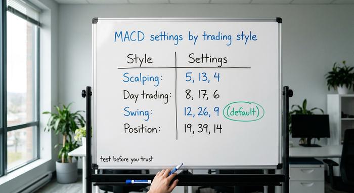
Best MACD settings for crypto trading
The default settings are 12, 26 and 9. Appel chose those numbers for daily stock charts in the 1970s, when markets closed at night and on weekends. Crypto never closes. It trades 24 hours a day, seven days a week, and it moves far harder than equities, so many crypto traders speed the MACD up to react sooner.
A common crypto convention is something faster, like 8, 21, 5. Be honest about what that is, though: it is practitioner habit, not proven science. A peer-reviewed 2023 study in the Journal of Risk and Financial Management found no universal optimal MACD parameter set. What works on a four-hour Bitcoin chart may be noise on a one-minute altcoin scalp. And crypto is no longer the separate planet it once was; the correlation between Bitcoin and the S&P 500 climbed from about 0.01 to 0.36 between the 2017–19 and 2020–21 periods, according to the IMF.
| Trading style | Typical timeframe | Example settings |
|---|---|---|
| Scalping | 1–15 min | 5, 13, 4 |
| Day trading | 15 min – 1 hr | 8, 17, 6 |
| Swing trading | 4 hr – daily | 12, 26, 9 (default) |
| Position trading | Daily – weekly | 19, 39, 14 |
Treat every row as a starting point to test, not a magic formula. Faster settings react sooner but whipsaw more; slower settings lag but lie less.
One rule travels well across crypto, though — the higher the timeframe, the more reliable the signal. A MACD crossover on the weekly price chart reflects a real shift in momentum; the same crossover on a one-minute altcoin chart is mostly noise dressed up as information. If you are new to the tool, start on the daily chart and work down only once you trust what you are seeing.
How to use the MACD in a crypto strategy
One disciplined setup beats reacting to every flicker. The MACD works best as a confirmation tool inside a plan, not as a standalone trigger.
Start with the trend on a higher timeframe. If Bitcoin is in a clear uptrend on the daily chart, only take bullish MACD signals on the four-hour, and ignore the bearish ones as noise. Then stack confirmations. A signal-line crossover that happens above the zero line, while price holds above a key moving average, is far stronger than a crossover in isolation. Add the relative strength index (RSI) as a second opinion: if the MACD turns up and RSI is also rising from a low, the two agree, and agreement is what you want.
A simple example. On a four-hour ETH chart, you wait for the MACD line to cross above the signal line while it is also above zero, with RSI climbing through 50. That is your entry. You exit when the MACD crosses back below the signal line, or when bearish divergence appears against a fresh high. No guessing, just rules.
Rules need a stop, though. Place it where the idea is proven wrong, not where it merely hurts (below the recent swing low on a long trade, for instance). The MACD tells you when momentum agrees with your idea; it says nothing about how much to risk. The traders who last in crypto size their position first and read the indicator second, because a good signal on an oversized bet still ends careers.
MACD vs RSI: which momentum indicator?
This is the wrong question, because they do different jobs. The MACD reads momentum and trend from moving averages and has no fixed range. The RSI is a momentum oscillator bounded between 0 and 100, built to flag overbought and oversold conditions. One tells you which way momentum is leaning, the other tells you when a move may be stretched.
| MACD | RSI | |
|---|---|---|
| What it measures | Trend momentum (gap between EMAs) | Speed of price change |
| Range | Unbounded | 0 to 100 |
| Best for | Trend shifts, momentum | Overbought / oversold |
| Main weakness | Lags, whipsaws sideways | Can stay extreme in strong trends |
Used together they cover each other's blind spots. Used alone, each leaves a gap the other would have caught.
Why the MACD is a lagging indicator
Now the honest limitation. The MACD is a lagging indicator, full stop. It is built entirely from moving averages, and a moving average is nothing more than a summary of past prices, so the tool always confirms a move after it has already begun. Anyone selling it as a way to call tops and bottoms in advance is overselling it. It simply cannot do that.
The lag bites hardest when a market goes nowhere. Let a coin chop sideways and the two lines cross back and forth, firing false signal after false signal until the crossovers are close to worthless. This is not just chart-reading folklore. A 2022 study tested MACD crossover strategies on US indices and found win rates below 50% over the 2015 to 2021 period when the indicator was used on its own. Divergence can mislead too: a market can show bearish divergence and keep climbing for weeks before it finally turns, which is why divergence is a warning, not a timing tool.
None of this makes the lag a defect to engineer away. It is the price you pay for a smoother, less jumpy reading, and that smoothing is exactly what stops the MACD from screaming on every tiny price tick. The fix is not a faster setting; it is to accept the delay and stop asking the tool to do something it was never built to do.
Common MACD mistakes crypto traders make
Most MACD losses come from a short list of repeatable errors, not from the indicator itself.
The one I see most often is trading every crossover. In crypto's frequent sideways stretches, that is a fast way to get chopped to pieces. The second is using the MACD in a ranging market at all; it is a trend tool and needs a trend to work. The third is ignoring the higher-timeframe trend and taking signals against it. The fourth is treating divergence as a precise entry, when it can persist far longer than your stop-loss will survive. The fifth is reaching for exotic custom settings while skipping basic price action and trend analysis. And the biggest one is using the MACD entirely alone, which the research above suggests is a coin flip at best. The tool is a lens, not the whole eye.
Putting the MACD indicator to work
The MACD indicator is a momentum lens, not a crystal ball. Read the histogram for early warnings, respect the fact that it lags, weight divergence over raw crossovers, and always confirm against the trend and a second indicator like RSI. Do that and it becomes one of the more useful things on your chart. Trade it blindly and it becomes an expensive random number generator. Which one it is depends entirely on how you use it. So before your next trade, ask: is the MACD confirming your idea, or are you just obeying a crossover?